

Just like in web development, android development uses cards to align or group certain or related elements together. The cards bring out a good user experience due to the use of shadows and elevation that the cards have. Mostly, while working with images in android, cards are preferred to hold the image property. Cards were introduced in the android studio when android version 5 was released which supports API level 21 and is commonly known as lollipop
In this article, we shall cover how to initialize card view in android, how to add card view in android, and show examples working with card views in android.
By default, cards are not included in the android studio application, so you have to import the card view as a dependency so that its features can be included in the project you are working on. To work with dependencies, you can follow this previous article and learn how to add dependencies in android studio
Open the build.gradle file for module app and inside the dependencies add this line of code
implementation "androidx.cardview:cardview:1.0.0"
Please note for this code to work you must be using kotlin as the language for development and ensure that android studio is updated to the latest version
Once you have added the code above, click sync at the top of the file so that the card view functions can be imported to your project and wait for the process to finish.
The full build gradle file code will look like this
plugins {
id 'com.android.application'
id 'kotlin-android'
}
android {
compileSdkVersion 29
defaultConfig {
applicationId "com.example.kotlinexample"
minSdkVersion 22
targetSdkVersion 29
versionCode 1
versionName "1.0"
testInstrumentationRunner "androidx.test.runner.AndroidJUnitRunner"
}
buildTypes {
release {
minifyEnabled false
proguardFiles getDefaultProguardFile('proguard-android-optimize.txt'), 'proguard-rules.pro'
}
}
compileOptions {
sourceCompatibility JavaVersion.VERSION_1_8
targetCompatibility JavaVersion.VERSION_1_8
}
kotlinOptions {
jvmTarget = '1.8'
}
}
dependencies {
implementation "org.jetbrains.kotlin:kotlin-stdlib:$kotlin_version"
implementation 'androidx.core:core-ktx:1.3.2'
implementation 'androidx.appcompat:appcompat:1.3.1'
implementation 'com.google.android.material:material:1.4.0'
implementation 'androidx.constraintlayout:constraintlayout:2.1.1'
testImplementation 'junit:junit:4.+'
androidTestImplementation 'androidx.test.ext:junit:1.1.3'
androidTestImplementation 'androidx.test.espresso:espresso-core:3.4.0'
implementation "androidx.cardview:cardview:1.0.0"
}
Next, we will now need to add the card view layout design in the xml folder
Add this code below to add the card view in the xml file
<androidx.cardview.widget.CardView
xmlns:card_view="http://schemas.android.com/apk/res-auto"
android:id="@+id/cardview1"
android:layout_gravity="center"
android:layout_width="200dp"
android:layout_height="200dp"
android:layout_margin="50dp"
card_view:cardCornerRadius="4dp"
tools:ignore="MissingConstraints">
</androidx.cardview.widget.CardView>
A card will be displayed in the design as follows
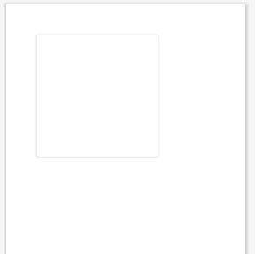
Having defined the card view, next you will need to add elements into it
How to add a text view in a card view
<androidx.cardview.widget.CardView
xmlns:card_view="http://schemas.android.com/apk/res-auto"
android:id="@+id/cardview1"
android:layout_gravity="center"
android:layout_width="200dp"
android:layout_height="200dp"
android:layout_margin="50dp"
card_view:cardCornerRadius="4dp"
tools:ignore="MissingConstraints">
<TextView
android:id="@+id/textview1"
android:layout_marginLeft="40dp"
android:layout_marginTop="40dp"
android:textSize="25dp"
android:layout_width="match_parent"
android:layout_height="match_parent"
android:text="Hello World" />
</androidx.cardview.widget.CardView>
How to add an image view in a card view
You can wrap the image to cover the whole card view by using the match parent property for both width and height
<androidx.cardview.widget.CardView
xmlns:card_view="http://schemas.android.com/apk/res-auto"
android:id="@+id/cardview1"
android:layout_gravity="center"
android:layout_width="200dp"
android:layout_height="200dp"
android:layout_margin="50dp"
card_view:cardCornerRadius="4dp"
tools:ignore="MissingConstraints">
<ImageView
android:id="@+id/imageView"
android:layout_width="match_parent"
android:layout_height="match_parent"
android:src="@mipmap/ic_launcher" />
</androidx.cardview.widget.CardView>
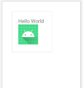
To include more than one element in the card view, for example, a text view and an image view, we can use a layout inside the card view to ensure that the elements will arrange themselves. For this example, we shall use a linear layout with a vertical orientation to align elements in top to bottom order
<androidx.cardview.widget.CardView
xmlns:card_view="http://schemas.android.com/apk/res-auto"
android:id="@+id/cardview1"
android:layout_gravity="center"
android:layout_width="200dp"
android:layout_height="200dp"
android:layout_margin="50dp"
card_view:cardCornerRadius="4dp"
tools:ignore="MissingConstraints">
<LinearLayout
android:layout_width="match_parent"
android:orientation="vertical"
android:layout_margin="30dp"
android:layout_height="match_parent">
<TextView
android:text="Hello World"
android:textSize="25dp"
android:layout_width="wrap_content"
android:layout_height="wrap_content"/>
<ImageView
android:id="@+id/imageView"
android:layout_width="100dp"
android:layout_height="100dp"
android:src="@mipmap/ic_launcher" />
</LinearLayout>
</androidx.cardview.widget.CardView>
The result will be like the one shown below
The full code for the xml file showing how to add and work with card view in android is as shown below
<?xml version="1.0" encoding="utf-8"?>
<RelativeLayout xmlns:android="http://schemas.android.com/apk/res/android"
xmlns:app="http://schemas.android.com/apk/res-auto"
xmlns:tools="http://schemas.android.com/tools"
android:layout_width="match_parent"
android:layout_height="match_parent"
tools:context=".HomeActivity">
<!-- A CardView that contains a TextView and imageview -->
<androidx.cardview.widget.CardView
xmlns:card_view="http://schemas.android.com/apk/res-auto"
android:id="@+id/cardview1"
android:layout_gravity="center"
android:layout_width="200dp"
android:layout_height="200dp"
android:layout_margin="50dp"
card_view:cardCornerRadius="4dp"
tools:ignore="MissingConstraints">
<LinearLayout
android:layout_width="match_parent"
android:orientation="vertical"
android:layout_margin="30dp"
android:layout_height="match_parent">
<TextView
android:text="Hello World"
android:textSize="25dp"
android:layout_width="wrap_content"
android:layout_height="wrap_content"/>
<ImageView
android:id="@+id/imageView"
android:layout_width="100dp"
android:layout_height="100dp"
android:src="@mipmap/ic_launcher" />
</LinearLayout>
</androidx.cardview.widget.CardView>
</RelativeLayout>