

While developing websites using bootstrap as the HTML and CSS framework you may have come to a situation where you want to keep users not lost when they are not at the top of the page, that is, ensure that readers of your website content have access to other pages without necessarily scrolling back to the top for them to access the navigation bar that contains the links to other pages. This is helpful and important since when the user is scrolling down on a certain page, it keeps him in contact with all the other pages as the navigation bar will not be hidden.
In this article, we shall focus on how to create a bootstrap sticky header that will ensure that the navigation contents in the header of a website stay on top of the page whenever we scroll down. We shall highlight the requirements that are needed to ensure we create a bootstrap sticky header and show examples using code snippets.
To begin creating a bootstrap sticky header, you will need to have familiarized yourself with bootstrap basics which you can follow on this article which you will learn how to include bootstrap in your project. Also, you will need to understand how to work with jQuery of which we shall show you the necessary steps required.
To begin, you will need a bootstrap code snippet that will include the header that you want to be sticky when you scroll.
You can have a bootstrap code that has a navigation bar and body contents as below
<!DOCTYPE html>
<html lang="en">
<head>
<title>Bootstrap sticky header Example</title>
<meta charset="utf-8">
<meta name="viewport" content="width=device-width, initial-scale=1">
<link rel="stylesheet" href="https://maxcdn.bootstrapcdn.com/bootstrap/3.4.1/css/bootstrap.min.css">
<script src="https://ajax.googleapis.com/ajax/libs/jquery/3.5.1/jquery.min.js"></script>
<script src="https://maxcdn.bootstrapcdn.com/bootstrap/3.4.1/js/bootstrap.min.js"></script>
</head>
<body style="height:2000px">
<nav class="navbar navbar-default">
<div class="container-fluid">
<div class="navbar-header">
<a class="navbar-brand" href="#">Website Example</a>
</div>
<ul class="nav navbar-nav">
<li class="active"><a href="#">Home</a></li>
<li><a href="#">Link 1</a></li>
<li><a href="#">Link 2</a></li>
<li><a href="#">Link 3</a></li>
</ul>
</div>
</nav>
<div class="container">
<h3>Sticky header example</h3>
<p>this is an example of bootstrap sticky header example.</p>
</div>
</body>
</html>
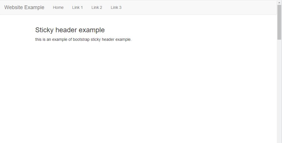
To show the working of the sticky header for a page that does not have much content, I have set the height of the body to 2000px so that the scroll effect can be visible. If you have content on your website you will not need to add the height attribute.
When you run the code snippet above you will obtain a webpage like shown below
Next, we will now need to add the features that will enable the header to stick when we scroll.
At the beginning of navbar section, add an id attribute and assign header value to it.
<nav id="header" class="navbar navbar-default">
Add a CSS style to the header value in the head section as shown below
<style>
#header{
position:sticky;
top: 0 ;
width: 100%;
z-index: 1030;
}
</style>
The header value will have attributes
Position sticky which prevents the element from moving
Top:0 means that it should stick to the beginning of the page which is left at 0px and top at 0px
Width: 100% ensures the navbar occupies the full width of the browser
z-index defines the order of overlapping. When the z-index is higher, it means that it will be placed higher above the elements that are scrolling below it.
Having added the above, the full code snippet will be as shown below
<!DOCTYPE html>
<html lang="en">
<head>
<title>Bootstrap sticky header Example</title>
<meta charset="utf-8">
<meta name="viewport" content="width=device-width, initial-scale=1">
<link rel="stylesheet" href="https://maxcdn.bootstrapcdn.com/bootstrap/3.4.1/css/bootstrap.min.css">
<script src="https://ajax.googleapis.com/ajax/libs/jquery/3.5.1/jquery.min.js"></script>
<script src="https://maxcdn.bootstrapcdn.com/bootstrap/3.4.1/js/bootstrap.min.js"></script>
<style>
#header{
position:sticky;
top: 0 ;
width: 100%;
z-index: 1030;
}
</style>
</head>
<body style="height:2000px">
<nav id="header" class="navbar navbar-default">
<div class="container-fluid">
<div class="navbar-header">
<a class="navbar-brand" href="#">Website Example</a>
</div>
<ul class="nav navbar-nav">
<li><a href="#">Home</a></li>
<li><a href="#">Link 1</a></li>
<li><a href="#">Link 2</a></li>
<li><a href="#">Link 3</a></li>
</ul>
</div>
</nav>
<div class="container">
<h3>Sticky header example</h3>
<p>this is an example of bootstrap sticky header example.</p>
</div>
</body>
</html>
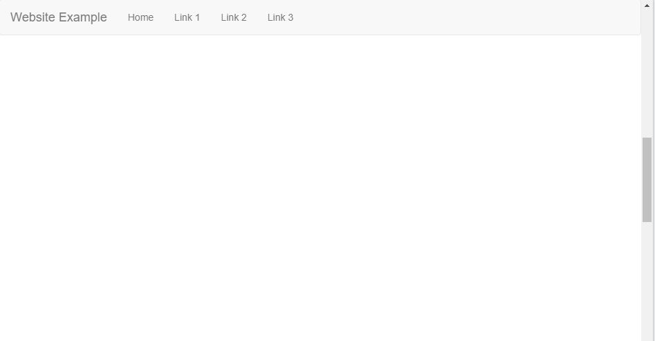
When you run the above code and scroll down the page, you will note that the header will be left at the top of the page even when you are at the bottom page.
With that, you will have created a sticky navigation header at the basic level.